Desan Game
Role: UX/UI Designer
Industry: Retail Execution
Platforms: iOS, Android
Project Duration: 3 months
Years: 2019–2020
Introduction
Overview
Desan Game is a mobile app designed for merchandisers, using gamification elements to enhance efficiency and engagement in their daily tasks.
Product Description
The game space is presented as a map of a real city, which is divided into districts. A team of merchandisers is attached to each district. The goal of the merchandisers is to visit the points (shops) of their district, check the arrangement and availability of goods on the shelves and take before and after photos with the help of the application's camera. If everything is done correctly and the captain (supervisor) confirms the arrangement of goods — the point is considered captured and the merchandiser receives points and trophies (for individual and team). It is possible to get various achievements for different actions. Every three days the capture of a point is reset and it is necessary to carry out the arrangement again. If necessary, a team can call for reinforcements (request help from other teams).
Besides the map with POS locations, the app includes a news feed that aggregates updates on team actions and achievements, as well as certain activities of other teams; a player chat for communication and coordination; a player profile with information on achievements, ratings, awards, and team affiliation; a team space showing member lists, ratings, achievements, and awards; informational pages; and a support chat for assistance.
Collaboration and Workflow
Team Structure and Roles
I worked as a freelance UX/UI designer responsible for conducting research, UX planning, prototyping, design layouts, and validating the designs before passing them to the developers. To create onboarding illustrations, badges, awards, trophies, and other vector graphics, I engaged a freelance illustrator. The development team, led by a team lead, was externally hired. A client representative acted as Project Manager, overseeing tasks and alignment. Also, client-side marketers contributed by writing select in-app text and developing player terminology, such as statuses and ranks.
Workflow Process
The project followed a Kanban workflow. We held daily meetings that included the Project Manager, the development team lead, and myself, with additional participants from the development team joining as needed. This setup ensured alignment and allowed for quick adjustments based on evolving project needs.
Design Process
Discovery
The client provided an initial concept outlined across several pages. To validate and refine this concept, I conducted a thorough Discovery phase aimed at defining user needs, verifying assumptions, and identifying potential risks.
I began by analyzing the client’s documentation to understand the core goals and constraints. This helped clarify areas that required further investigation or adjustments. I conducted in-depth research on the target audience, focusing on the challenges faced by merchandisers. A market review revealed no similar solutions currently addressing their specific workflow needs.
I developed hypotheses on how gamification could enhance engagement and efficiency. During the process, I held regular feedback sessions with the client, allowing us to refine our ideas and maintain alignment as we moved forward.
Based on the data gathered during the Discovery phase, I created Personas and built a Customer Journey Map, which helped me identify moments of frustration and key touchpoints with the product that needed improvement. As a result, I formed a Product Vision, highlighted the most critical user problems that the product should address first, and formulated hypotheses to be tested during the prototyping and testing phases.
UX Analysis and Synthesis
After completing the Discovery phase, I moved on to the processes of data analysis and synthesis to turn the gathered information into clear insights and guide product improvements.
I began by systematically organizing the data collected during research. To identify patterns and common issues, I used the Affinity Mapping method, grouping similar ideas and observations. Based on this, I conducted Thematic Analysis to highlight recurring themes that helped identify users’ core problems. I also performed Quantitative Analysis, analyzing survey data to understand the scale of issues, such as how often users faced difficulties while interacting with the product.
After analyzing the data, I moved on to synthesizing it into actionable insights and solutions. To structure these insights, I used Problem Framing, prioritizing the most critical issues. I also refined the Personas, making them more accurate based on the new data, allowing for a deeper understanding of the target audience. Based on the identified problems, I created an Opportunity Map, pinpointing areas for improvement.
At the end of the analysis and synthesis phase, I prepared insight reports that helped the team and the client gain a clear understanding of the problems and opportunities for improvement. Additionally, I created a prioritized list of issues, which became the foundation for developing solutions and the next stage of product work.
Ideation
At the next stage, we moved on to generating ideas to address the issues identified in the previous phases. We conducted a series of workshops with representatives from the client company to leverage diverse perspectives and expertise. It was important for me to explore a wide range of options, including unconventional and even provocative ideas, to discover the most effective solution.
During remote meetings held via Zoom, we utilized several proven ideation techniques. Brainstorming was frequently employed to gather as many ideas as possible, followed by discussions to select the most promising ones. We also used the Crazy 8s method, where participants sketched eight quick ideas in eight minutes. To address specific problems, we applied the HMW (How Might We Questions) framework, while Mind Mapping helped us structure emerging ideas and solutions effectively.
UX Prototyping
As the project progressed, I created prototypes to visually represent the results of the Ideation phase and identify issues before development began. Early on, these were wireframes that I quickly created in Whimsical.
Later, I created a refined, clickable prototype in Figma to help developers better understand what needed to be created, reduce the number of revisions during the coding phase, and accelerate the workflow.
UI Design
When the prototypes were approved, I moved on to creating the final app screen designs using Figma, my primary tool.
Since we were developing the app for both iOS and Android, the first decision was whether the app would follow the design guidelines of each platform or if we would create a custom design using the company’s branding style. I made a well-reasoned case for the latter, arguing that, although it was a bit more challenging for the developers, it maintained a consistent user experience across platforms and simplified and sped up my work. Of course, I considered the platform-specific features and implemented the familiar differences for users of each.
I incorporated the company’s brand colors—green (primary), yellow, and red—to make the app vibrant. These were applied contextually: green for positive actions, approvals; yellow for highlights, warnings; and red for critical actions or significant game events.
For game-related visuals, such as rewards, trophies, onboarding illustrations, and empty states, I hired a freelance illustrator. I introduced her to the app concept, company branding, and provided an extended color palette based on the corporate colors. After compiling a detailed task list, she sent several style options. Once approved, she delivered all required illustrations in the agreed style.
Developer Handoffs
As I created the app’s layouts, I placed the completed ones on the “Finished Layouts” page in the Figma project, so the developers could begin working on them. I created a brief style guide describing the states of all interactive elements. I also built prototypes to demonstrate element animations, micro-interactions, scroll animations, and other aspects that were difficult to describe with text.
I had several calls with the development team to introduce them to the interface, explain its logic, and answer questions. Additionally, I was always available on Slack to quickly respond to any questions that arose. Of course, we had detailed documentation for the entire app, from the initial ideas to the final solutions, which we updated as the work progressed.
Once the app was sufficiently complete, I began conducting periodic design reviews to identify layout errors and check for consistency with the mockups. Any discrepancies I found were added to the Kanban board as tasks for the developers to address.
Validation
To verify and validate hypotheses, ideas, and solutions, ensuring they effectively address identified user issues and meet their needs, we employed various methods during the validation stage. This step minimizes the risk of errors in later product development phases and confirms the design’s usability and relevance for the target audience.
At my initiative, the client representative assembled a focus group of future users. They were introduced to the app’s concept and prototype, followed by usability testing for several scenarios. Post-testing, we conducted interviews, analyzed survey data, and confirmed certain hypotheses, ensuring our decisions were accurate.
When we launched the first working version and began testing it with users in a single city, we started gathering feedback through client representatives, focusing on their direct interactions with users and observations during the testing process. This feedback provided insights into aspects users liked and those requiring improvement. Additionally, we processed usability-related support team messages, systematically analyzed all information, and identified interface elements and scenarios needing enhancement.
Key challenges and solutions
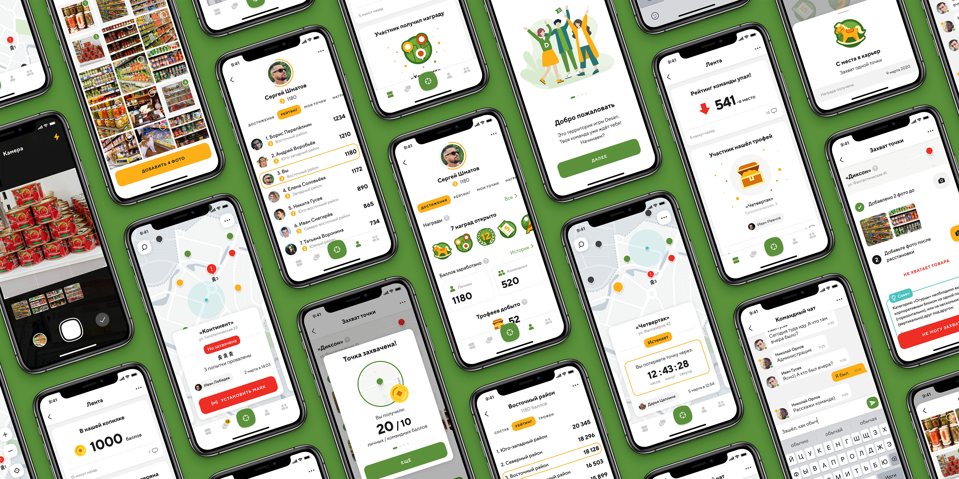
Main screen
Problem: It was necessary to create a game space and logic, define the game entities, and ensure that tasks were clear and visually understandable.
Approach: Since merchandisers work in the physical world, visiting retail locations, a map with store markers was the most suitable choice for the game space. Testing was planned for one city first, with later scaling to all cities where the company operates. The client provided store lists and divided cities into optimal zones. Together with the client, we defined the statuses of the points and the timing for their transitions, which could be adjusted after the app’s launch.
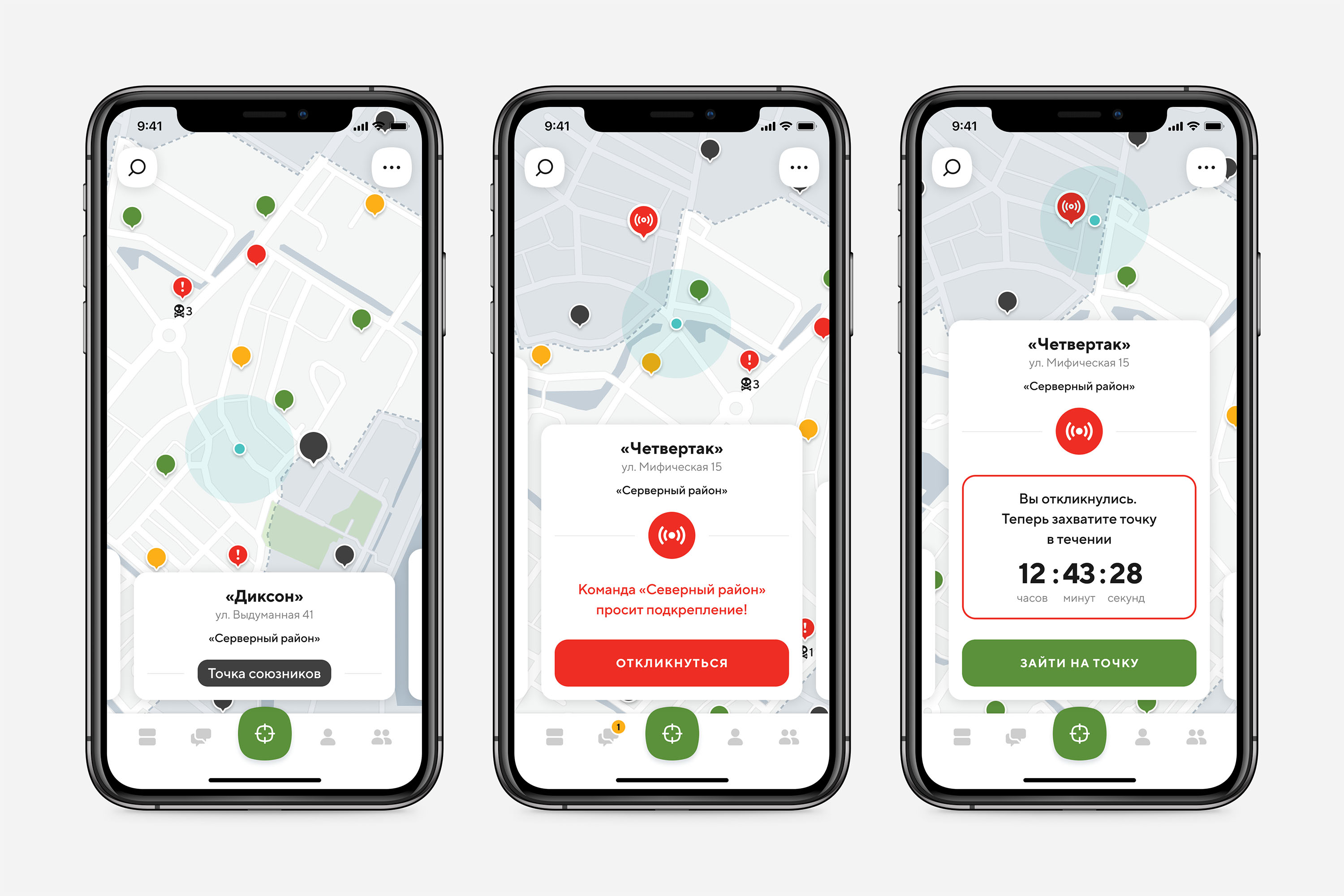
Solution: The main screen of the app is a map with markers representing Points of Service (POS). The map is divided into districts, with other teams’ districts appearing shaded. Tapping on a marker in the user’s district opens a detailed card showing the point’s name, address, status (“Captured,” “Expiring,” or “Lost”), and information about the last capture attempt (by whom and when). Two days after being “Captured,” the point’s status changes to “Expiring,” and a countdown timer appears on the card, showing how soon it will transition to “Lost.” When a user physically approaches the point within a certain range, a “Check-in” button becomes available in the point’s card.

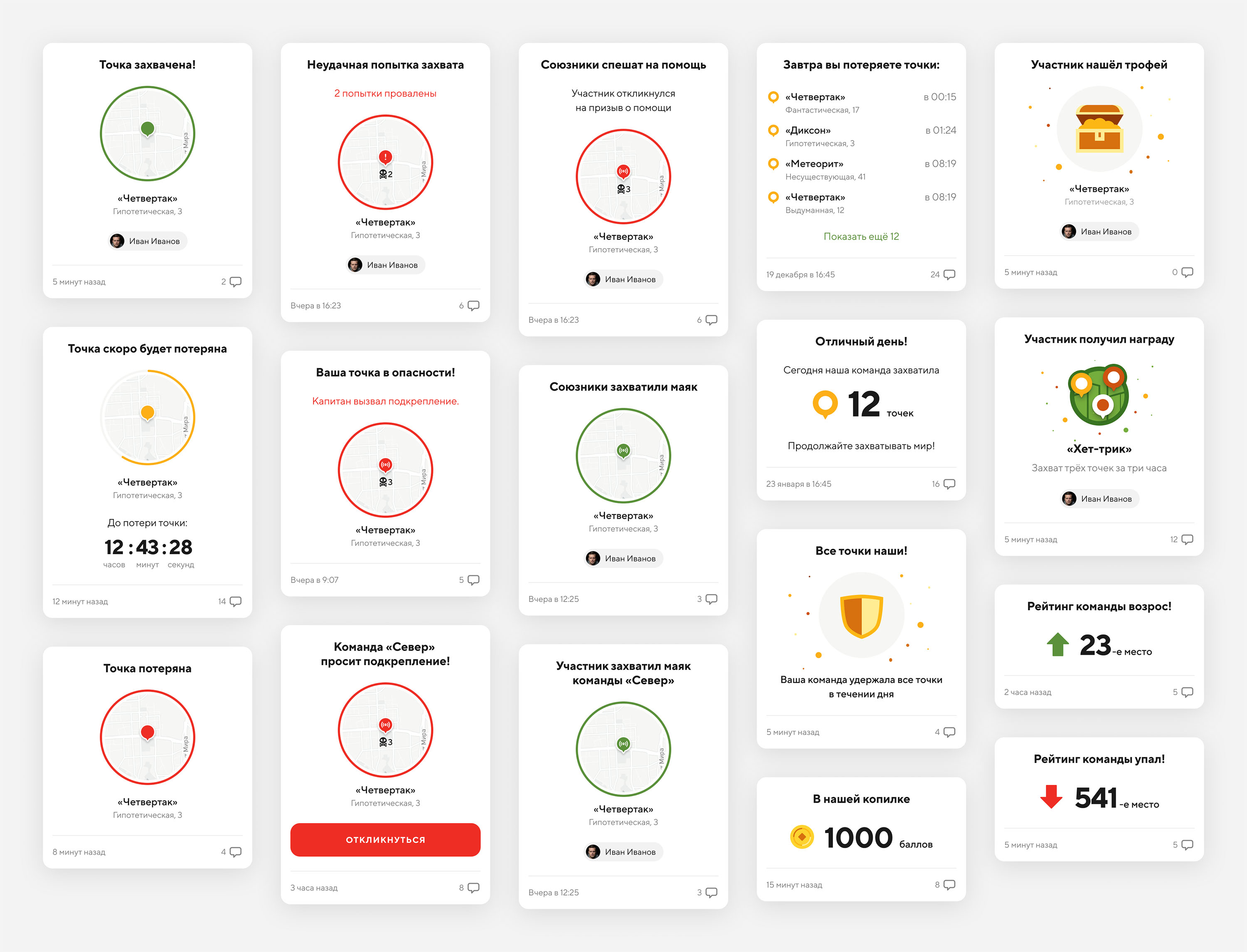
A point becomes “Lost” three days after being “Captured” if no one revisits it to recapture. If players attempt to capture the point but fail, the point card and its map marker display the number of failed attempts. Three days after a point is “Lost,” the team captain can “set a beacon” to request help from neighboring districts. If someone responds, it becomes visible on the point card.

For points in other districts, users can only see the name, address, and district affiliation. However, if the district captain sets a beacon, participants from neighboring districts can respond. Tapping “Respond” starts a countdown timer, during which the player must reach the point and capture it. Points and trophies for successful captures of beacon-marked points are awarded to the player who captures the point and their team.
The question of whether to display all players’ markers on the map remains unresolved, as it requires further discussion regarding the client company’s policies.
Capture screen
Problem: It was necessary to develop a mechanism for how participants would change a point’s status to “captured” and make the process simple, engaging, and exciting.
Approach: The merchandiser’s job is to visit stores with the company’s products and arrange items on shelves according to company guidelines. It was decided that confirmation of the merchandiser’s work would be photos taken before and after rearranging. Additionally, we wanted to add more excitement, so we developed a system of trophies and rewards.
We didn’t have examples of patterns from other apps suitable for our needs, so we used brainstorming to define the approximate process for capturing points, also deciding to add an option to report product shortages, which would be useful for the relevant departments. I created a user flow diagram, and after several iterations and discussions, we finalized the process.
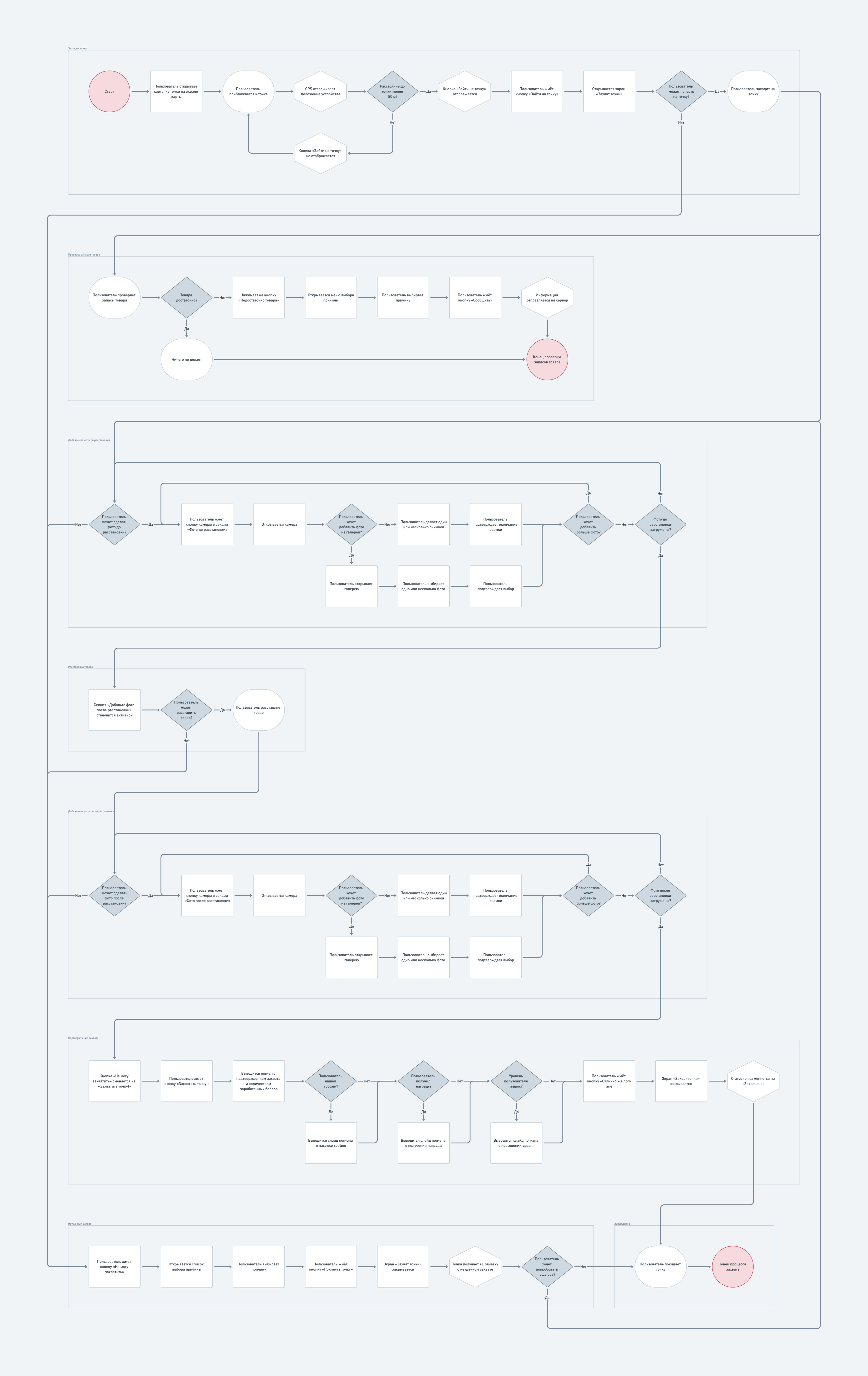
Solution: When a participant approaches a point within a sufficient distance, they see a “Visit Point” button in the point’s card on the home screen. Pressing it opens the Capture Screen, where they can upload before-and-after photos of the products, use buttons for capturing or reporting issues, and view randomly displayed restocking tips.

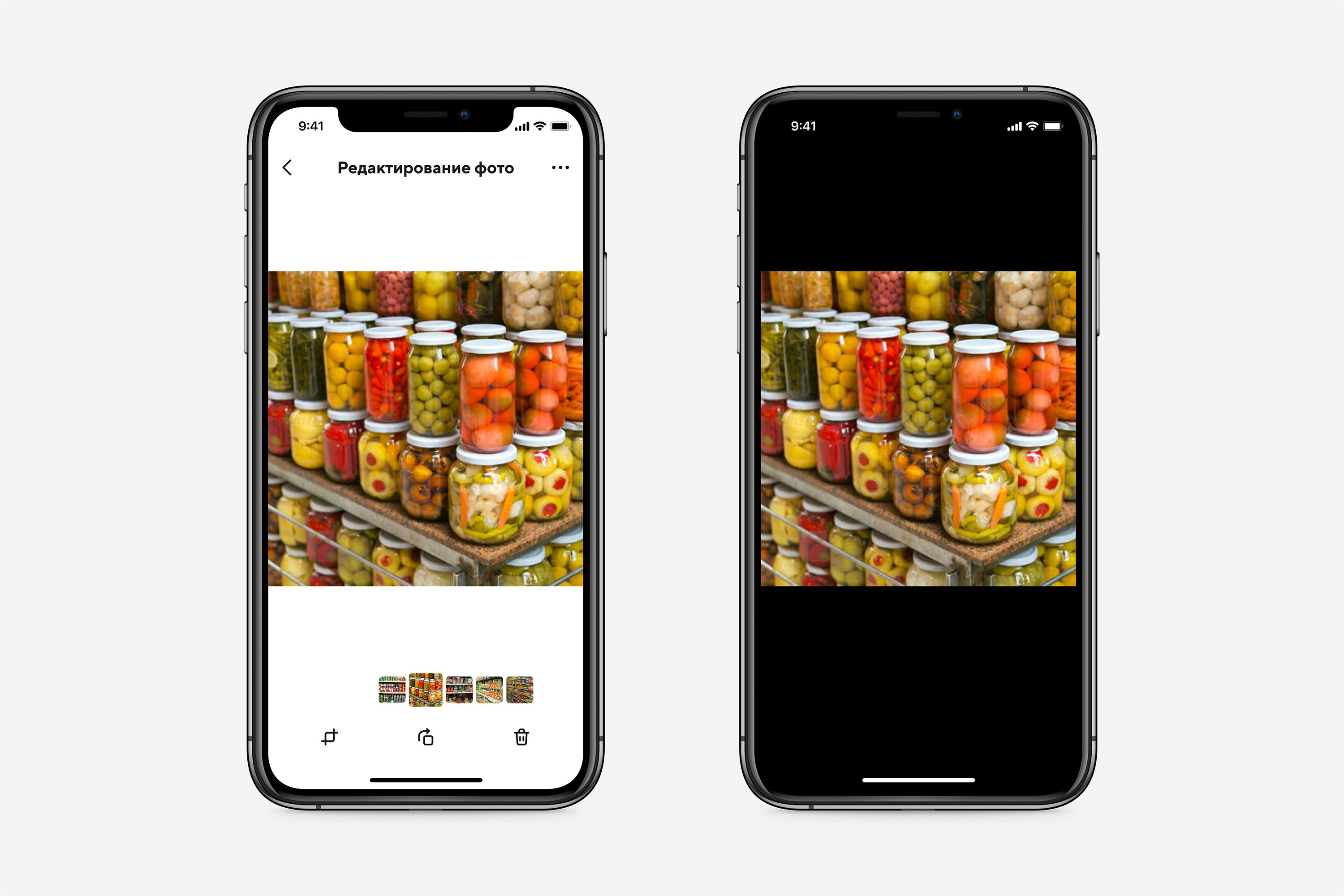
To upload photos, I designed a camera interface to make the process easy. Since it’s recommended to upload 3–7 photos, I provided the option to take multiple shots consecutively without reopening the camera between each shot, then add them all at once. The camera also includes a button for uploading previously taken images from the device’s memory, useful in some cases.

After uploading photos, the user can view them in detail, rotate or crop them, and delete any unnecessary ones.
If the merchandiser finds insufficient stock in the store, they can report it via the “Stock Shortage” button, selecting the appropriate option from a menu. Also, if the user cannot complete the task or take photos for any reason, they can report this using the “Cannot Capture” button, choosing a reason from the menu that appears.
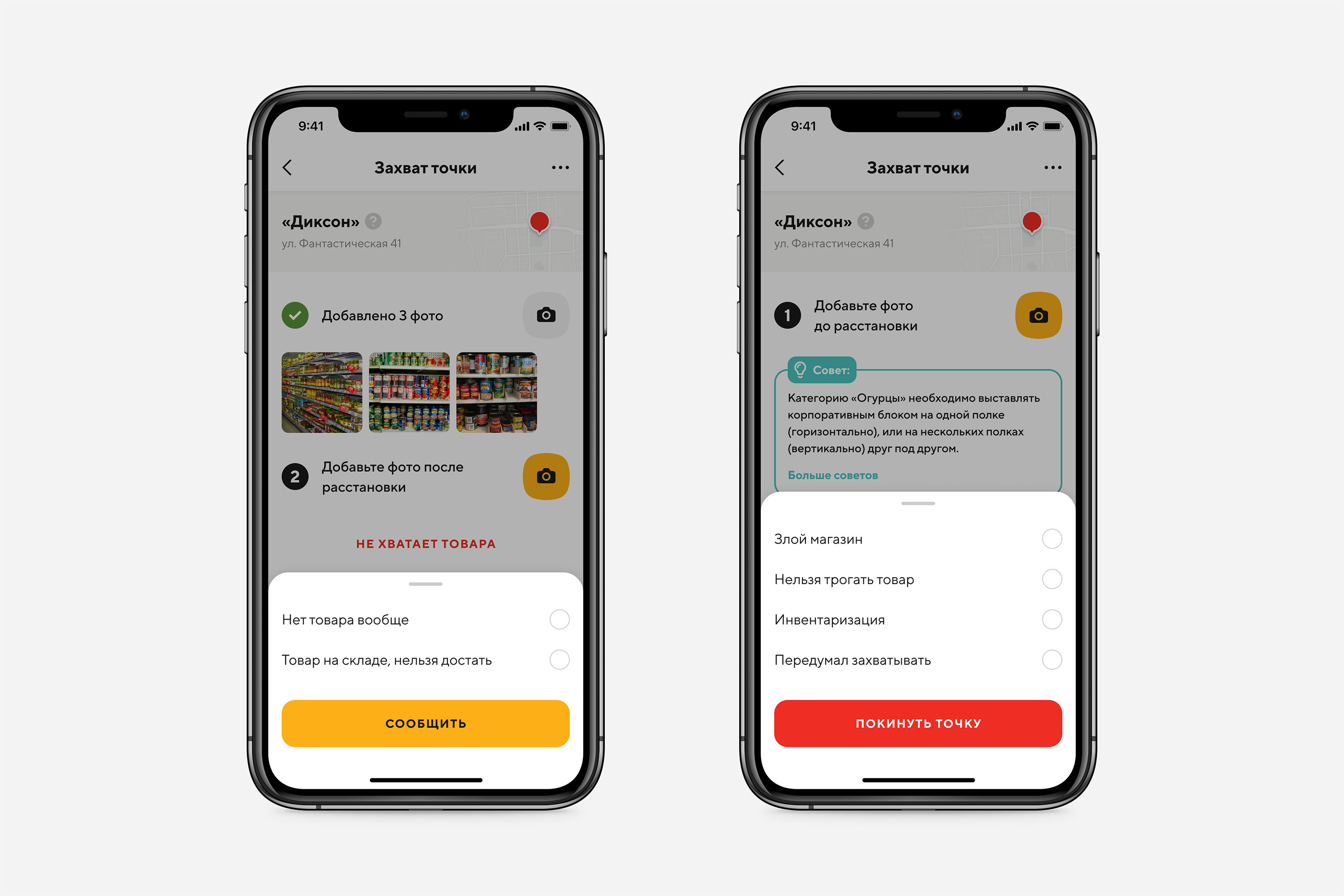
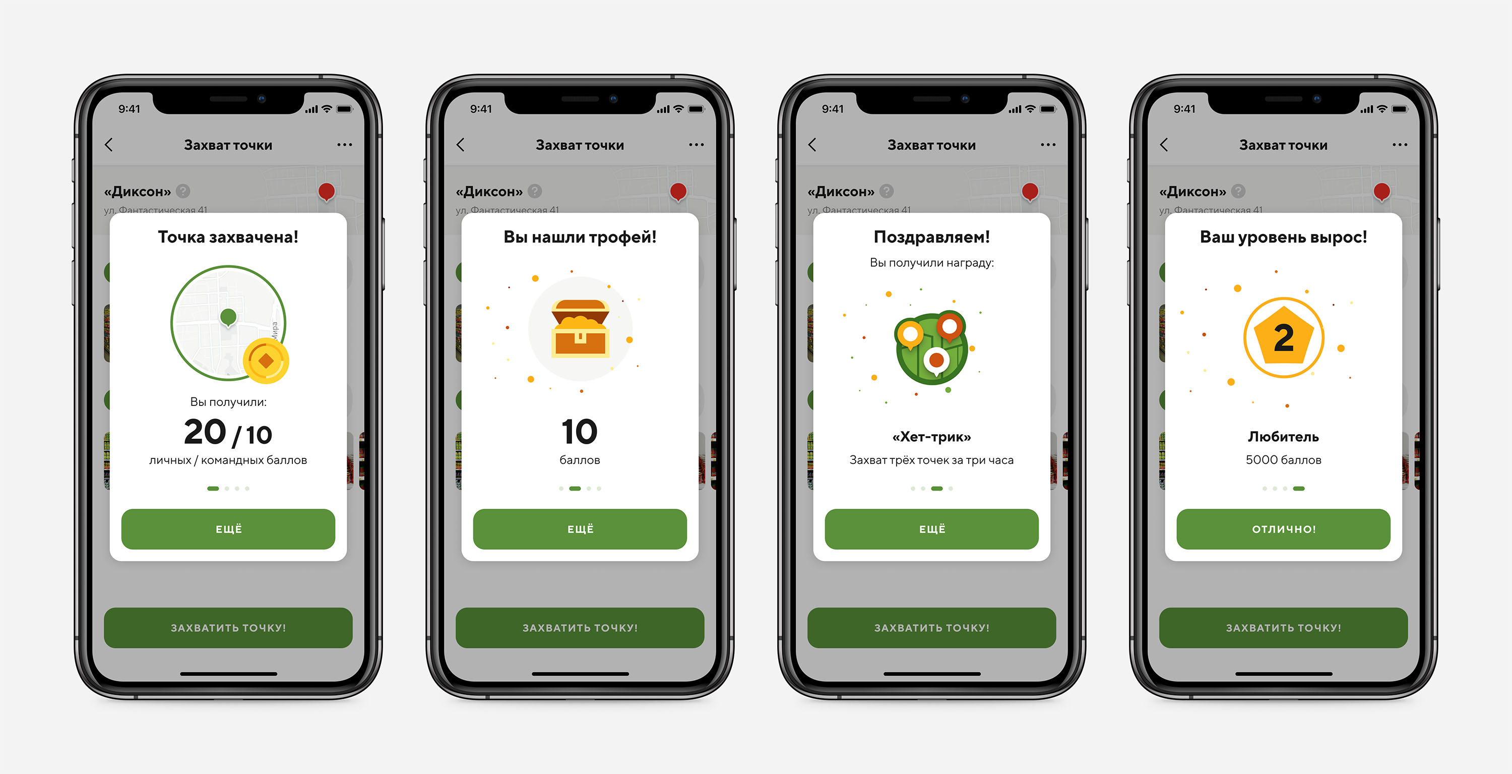
Once the before-and-after photos are uploaded, the “Cannot Capture” button changes to “Capture Point!”. Pressing it sends the photos to the system, updates the point’s status, and the user sees a confirmation screen showing the number of earned personal and team points, trophies, or level-ups, if applicable. Closing this screen takes the user back to the main screen with the map.
Feed
Problem: To coordinate actions and motivate participants to compete and perform better, users must stay informed about events such as point captures or losses, help requests from other teams, and especially achievements, rewards, trophies, and changes in team ranking and points compared to others.
Approach: Since awareness of ongoing events is a key feature that directly impacts user motivation and action coordination, we opted to visually display these events with time-stamping, sequential order, and consistent formatting for quick recognition in the limited time users interact with the app. Social media feed analogies were considered, but with much more concise content. We also listed events that could be automatically generated in response to user actions, team ranking changes, etc. Ideas for manual message creation in the feed were postponed until the full admin system was implemented.
Solution: The feed is presented as an infinite scroll of cards, primarily generated in response to key user actions. New cards appear at the top. In the feed, users see cards related to the status changes of points in their team’s district, actions by team members, and other team-specific events. The only exceptions are cards regarding help requests from other teams and responses to those requests — these are visible to participants in neighboring teams. Cards about point captures or losses include the point’s name, address, and map image. Cards about points at risk of being lost within the next hours feature a countdown timer. In addition to participant-driven events, the feed also includes daily summary messages, such as the number of points captured by the team that day and a list of points to be lost tomorrow.


Each card contains a timestamp. If it’s an action by a specific user, their photo and name appear on the card. In the second iteration, we added a commenting feature, which was designed to help participants discuss and analyze specific events or leave encouraging comments, fostering team cohesion.
Chat
Problem: To ensure team members could coordinate their actions, discuss strategies, and analyze completed tasks, it was necessary to provide a communication and coordination tool.
Approach: I analyzed potential communication methods, considering the app’s use case, budget, and timeline. Since users would mostly access the app on the go, I considered voice messaging, but listening to numerous messages can be time-consuming and challenging in noisy environments. Video calls were impractical due to development complexity and the difficulty for users to join while traveling. Text-based chat, while not perfect, emerged as the most efficient and accessible solution, allowing users to maintain context and review history at any time.
Solution: I designed a chat feature that supports text messaging, photo sharing from the phone gallery or using the built-in camera, tagging specific users, and identifying team captains with a distinctive badge. The chat also allows users to see who is currently online and the number of unread messages displayed within the chat interface and as a notification badge on the app’s main menu.

User screen
Problem: The user must have access to their participation history, ranking, rewards, and other statistics.
Approach: Together with client representatives, we developed a system of rankings, titles, and rewards to add excitement and competitiveness to the gameplay. The interface design followed a classic approach typical for such scenarios, relying on tried-and-tested solutions that are familiar and intuitive to users.
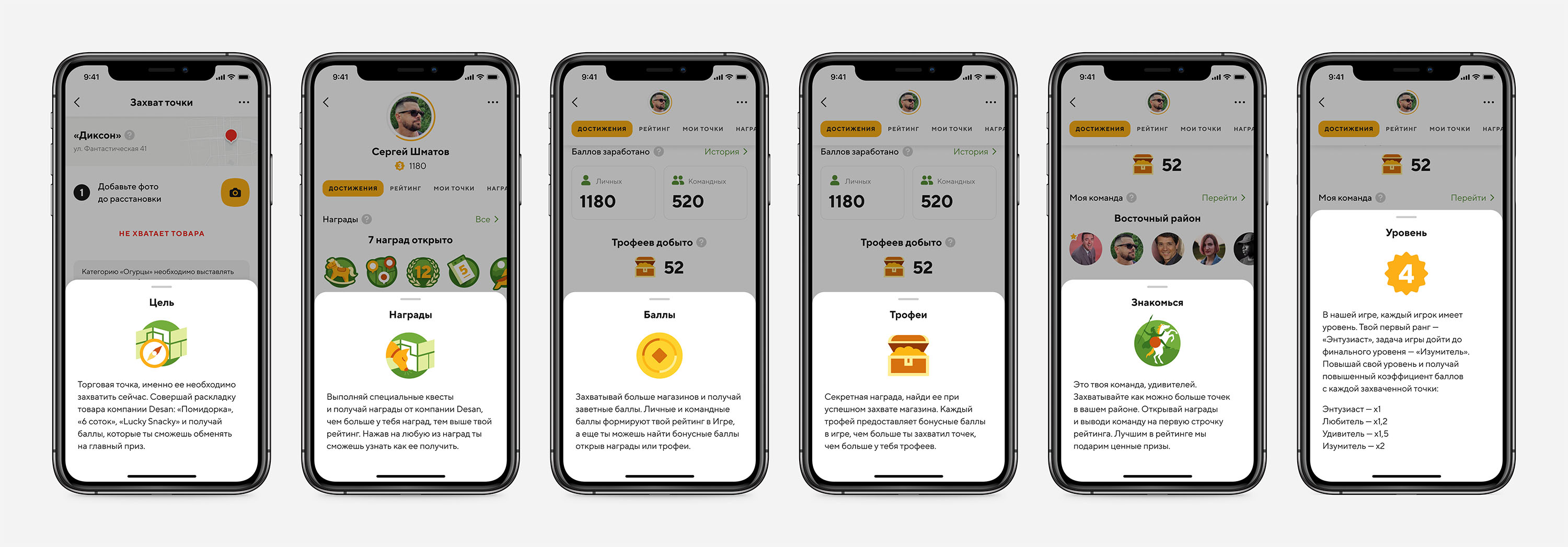
Solution: The user screen displays the player’s progress and is divided into tabs: “Achievements,” “Ranking,” “My Points,” and “Rewards.” At the top of the screen, the user’s photo and name are shown along with their status and ranking.
The “Achievements” tab shows summary information on unlocked rewards, earned points, trophies, player rank, and required points for rank progression, along with team details. Most sections provide links to view detailed information.
The “Ranking” tab displays the player’s ranking compared to others.

The “My Points” tab contains a list of the points captured by the player in chronological order, showing the number of points earned for each capture.
The “Rewards” tab lists unlocked rewards. Rewards are the same for all players and unlock when specific conditions are met, such as capturing a certain number of points within a time frame or assisting with certain tasks. Clicking an unlocked reward shows its description, conditions, and date. Unlocked rewards are hidden with a gray placeholder and a lock icon.

Team screen
Problem: Since team members work collaboratively, we wanted to introduce features that would enhance team spirit, improve cohesion, and further motivate them to achieve higher goals. Additionally, it was important to provide users with an overview of their team’s collective achievements.
Approach: We discussed how team interactions could be implemented and identified which user achievements could be shared within the team. By overlaying the company’s existing workflows with gamification elements, we made the merchandisers’ work more engaging. Team efficiency was measured by a rating system based on points earned when members successfully captured locations. We also introduced a trophy system, where participants could “find” trophies during successful captures.
Solution: I designed the team screen to resemble the user’s personal screen. At the top, it displayed the team name and its rating, followed by tabs for detailed views.
The “Members” tab provided information about the team composition, listing each member’s name, photo, and level. The team captain was marked by a special symbol.
The “Rankings” tab showed the standings of all teams in the city, complete with their respective ratings.
The “Trophies” tab displayed all trophies discovered by the team, along with the attributes of each trophy. Unfortunately, I cannot show this screen to avoid revealing game secrets.

Help and Support
Problem: Since the app includes numerous specific entities and gaming terms that might be unfamiliar to new users, we needed to ensure they had resources to navigate the app effectively. Additionally, we aimed to provide timely assistance for any issues related to the app or the associated processes.
Approach: I conducted an in-depth analysis of potential user challenges by mapping out the User Journey to identify pain points. Once these were identified, I collaborated with the client to craft concise and informative texts explaining app features and terminology. To enhance the onboarding experience, an illustrator designed visuals to make it more engaging and visually appealing.
We also recognized the importance of live technical support, as unresolved app issues could hinder the workflow of merchandisers instead of enhancing efficiency. Understanding the complexity of creating a support service from scratch, we tasked the development team with evaluating the effort involved and exploring suitable off-the-shelf solutions for seamless integration.
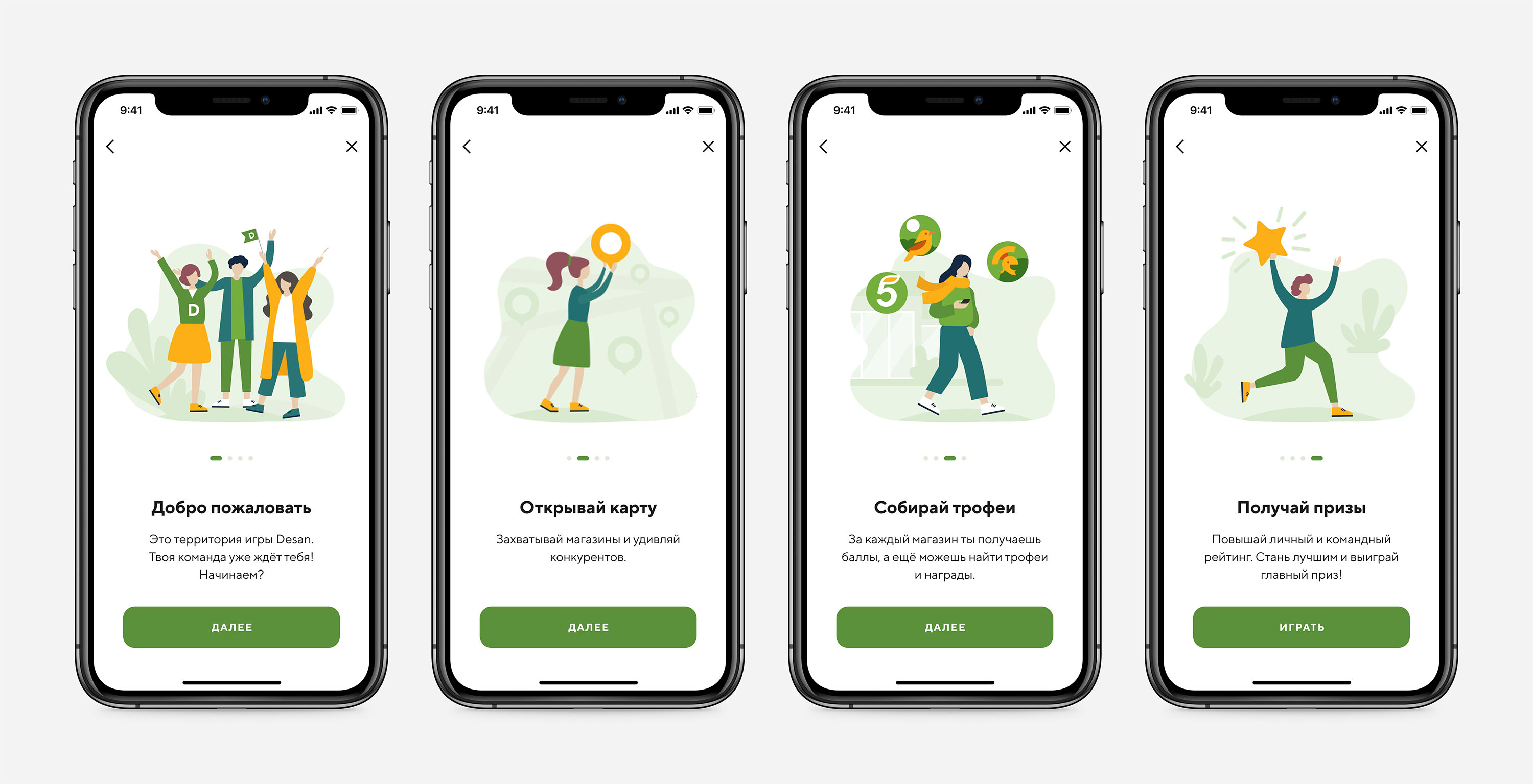
Solution: The onboarding screens were designed to motivate and introduce new users to the app’s objectives and processes. Since the app is implemented as a gamification element within an existing workflow, in principle, most users are already familiar with its goals.
To address potentially confusing gaming terms, I incorporated “?” icons next to specific terms within the app. These question mark icons, when tapped, open bottom sheets containing detailed explanations—a classic and user-friendly design pattern that has been tested and refined over the years.
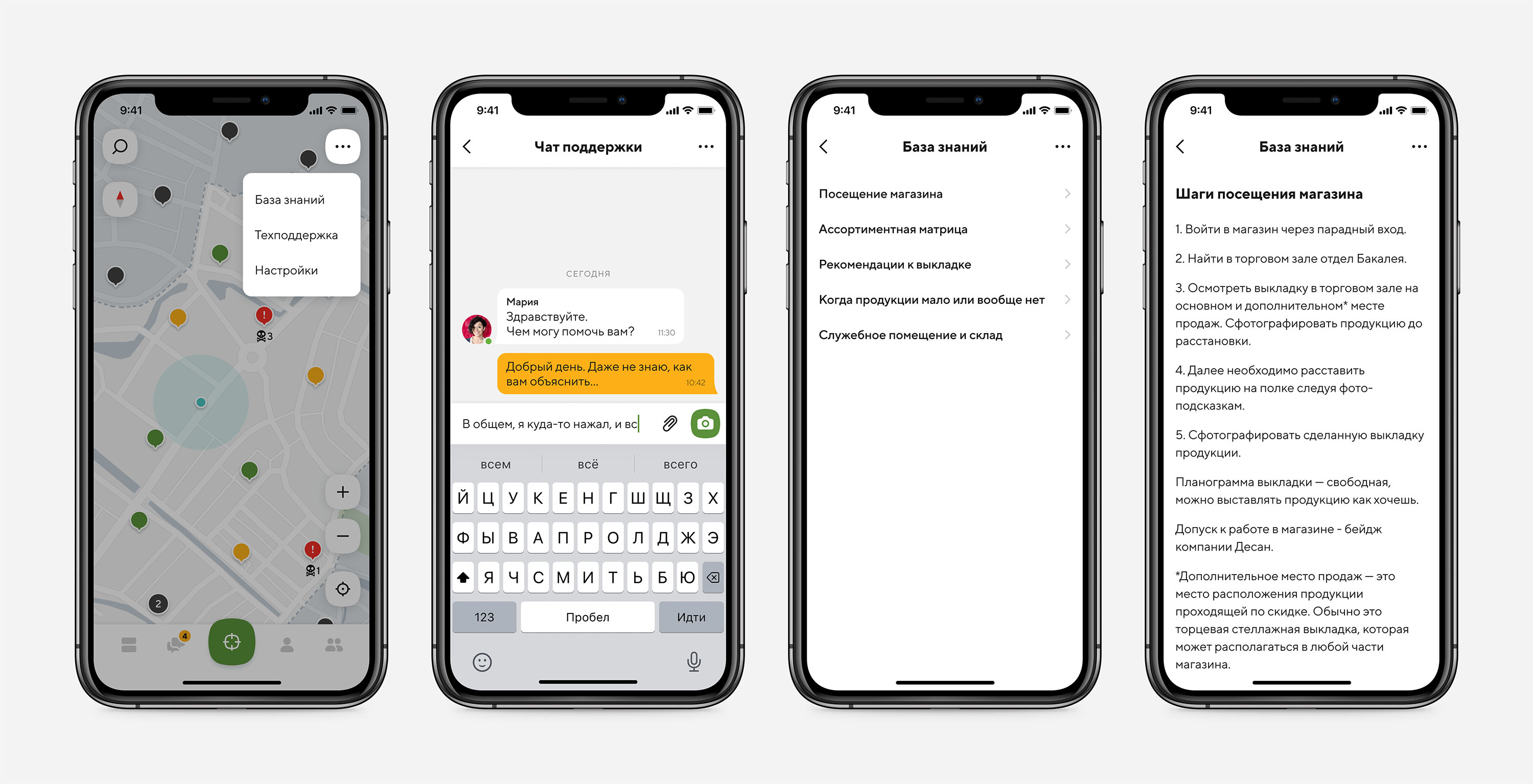
An additional menu, accessible from every screen via a “…” button, offers access to a support chat and a knowledge base.
For live support, we implemented a pre-built chat solution that integrates easily with both mobile and web applications, eliminating the need for extensive infrastructure development. This chat is staffed by a dedicated team of support operators, ensuring users receive prompt assistance.
Lastly, we created a comprehensive knowledge base for merchandisers. This resource contains detailed guidelines, algorithms for completing tasks, corporate standards, and other relevant materials. The knowledge base is structured into sections with text and images, making it easy for users to find the information they need.
Conclusion
This project was a comprehensive journey, combining research, design, validation, and collaboration to create a product that aligns with user needs and business goals. Each stage brought its own challenges, but also opportunities for learning and growth. By maintaining a user-focused approach, backed by thorough testing and iterative improvements, we were able to deliver a solution that not only solves the identified problems but also provides a seamless and engaging experience. This project reaffirmed my commitment to creating meaningful, user-centered designs that drive value.